

New UI for my text-to-speech player
I revisit the UI, hoping to improve the general experience.

TL; DR
My previous user interface (UI) could be, at best described as functional. Whilst it technically worked on any platform I tested, a desktop browser received the best experience. Recently @suivethefirst recommended Bootstrap to me. So I tried to make a better experience with this.
Putting the minimum into MVP
Putting together the UI as it stood was the last functional step in my project. Delivering an audio player with a combination of CSS and JavaScript felt beyond what I had in the tank at the time.
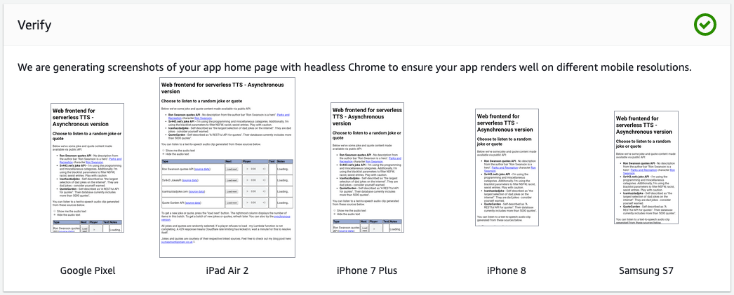
Therefore I used the native HTML5 audio player, which had some render differences across platforms. The AWS Amplify verify output illustrates the differences well:
A few factors contributed to this:
- Some scope creep meant I was converting and able to play from four sources. Unfortunately, I went with a player with source audio on a 1:1 basis.
- Next, I felt the need to cover the page with text citing references and explanation.
- Lastly, I wanted to introduce DynamoDB to my project. This addition was a success; however, I didn’t unify the players. Instead, I created a copy modified for different API routes.
The result? We now have eight different ways of getting audio across two separate codebases.
Opportunities and motivation for simplification
In taking on the UI challenge, I inherently took on the codebase refactoring task. To that end, I decided on the following:
- I would offer no choice on sync mode.
- There would be only one active player/content viewport.
The first option was further motivated by a time-bound decision in using AWS Polly. The free tier is for the first twelve months. The second would lead to a smaller UI.
Hello, world (again)
Learning to use Bootstrap for my purposes wasn’t nearly as hard as I feared. I had excellent documentation and examples.
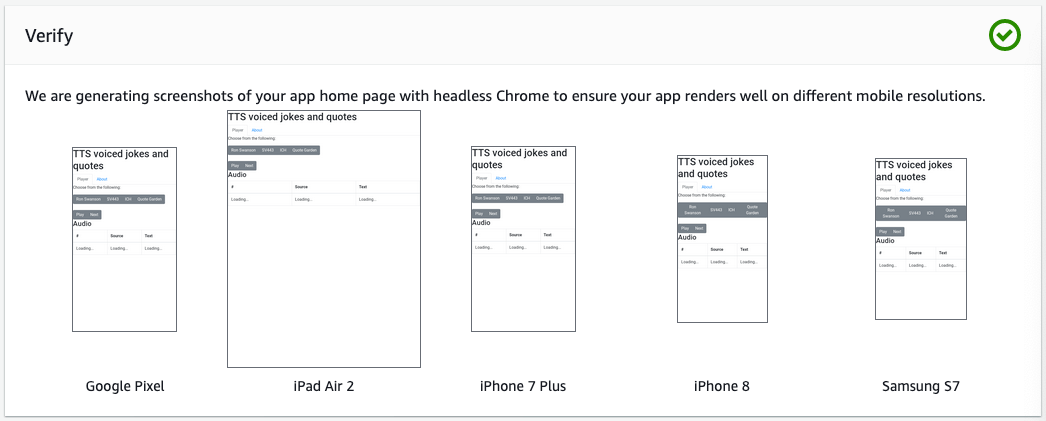
Using the iPhone render as an example:
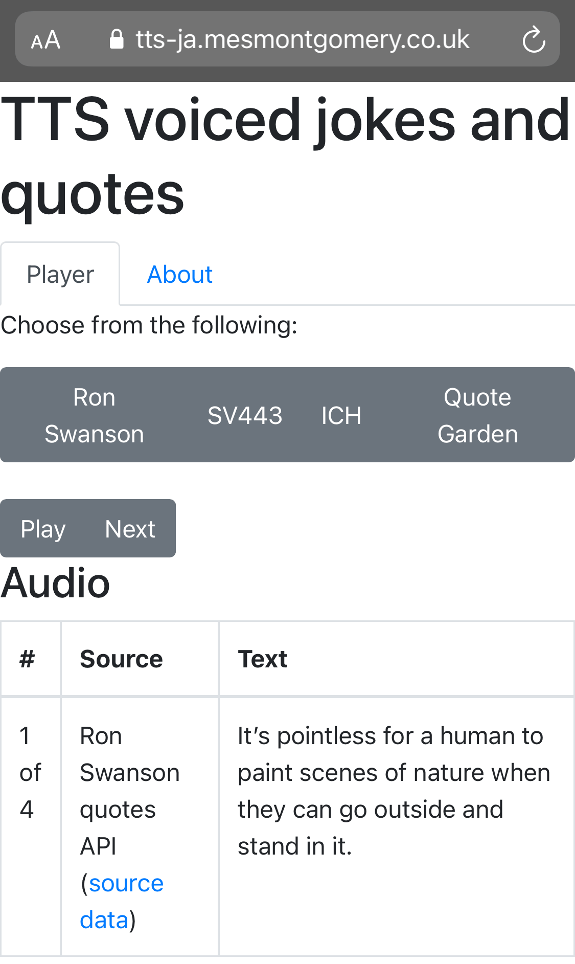
I elected to move all the explanatory text into the about Nav and reduce the button selection.
Conclusion
I believe I achieved something that offers a similar experience across devices now. It won’t win any awards for appearance, and its minimalist styling reflects both my talents and expertise in the user interface world. This time I’ve stayed away from scope creep to address to UI exclusively.
Here are some things I could think about in future:
- I want to return sync mode or another version of interactive TTS - however, with the cost element, I would need to introduce a quota system for cost control.
- Debugging remains a challenge in mobile devices. A poor mobile data connection means visitors may not experience a good first visit. This poor connectivity would manifest in it working on the second or third refresh. I am thinking about embedding some audio content for each route into the initial HTML.
Related posts
- API Diversions - experimenting with a new API via Cloudflare workers
- Introducing async to my serverless text-to-speech player for jokes and quotes
- My serverless “jokes and quotes” player
Acknowledgements
- Thanks to @suivethefirst for giving me the motivation to learn Bootstrap.
- Thanks to the Bootstrap team for their brilliant docs, they helped me enormously.
- Thanks to the folks at w3schools for their examples and great site.
- Thanks to OpenMoji for the ballon, book and speech parrot. I have modified the colours on the parrot.
- And thanks to the Lorem Ipsum site for their generator.
Share this post